Wednesday 29 June 2016

True Blue

Shades of blue and navy are very fashionable this summer for clothes and interior design and it is only natural that cards should  follow this trend too. Stampin'Up keeps an eye on new trends and their range reflects current styles. 

Blue is not the first colour you think of when making a floral card, but when I look around my garden, I see that I have very many blue flowers, not to mention bluebells and forget me nots.

With this mind, and trying to get yet more mileage from the same two stamp sets, Petite Petals and Flower Shop, I made the following two cards.

First off, an amazingly simple 'half and half' card using the Dapper Denim card stock from the new range.

I made a card base using Dapper Denim, one of the new In Colours introduced in the new SU catalogue. I then made a mount in Whisper White card and covered the bottom half with paper from the Neutrals Designer Paper Pack. I chose a soft silver paper with white dots, but other papers would also work - obviously not a floral one though or the punched flowers will get 'lost' against the background.

I used a length of the new Dapper Denim ruched ribbon to conceal the join. This ribbon is gorgeous -not too wide and the ruching gives it a built in texture. It can be a bit tricky to tie a neat bow though.

The greeting I used, stamped in Dapper Denim ink, is from the Suite Sayings stamp set, which has some really useful greetings.

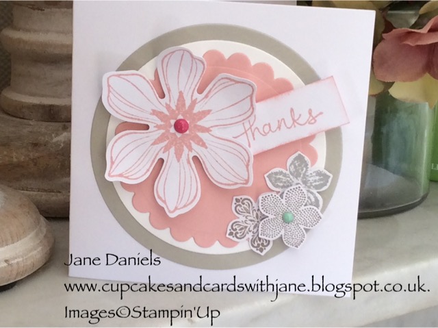
I had already stamped several flowers from the Flower Shop set and punched them out with the coordinating pansy punch. I used a couple of different blue shades - Marina Mist and Dapper Denim, and arranged three different flowers on the left hand side of the card. Only the central flower is elevated by a foam dimensional and highlighted with a White Perfect Accent stud.  I added one tiny Petite Petal flower to balance the group, with a tiny rhinestone in the centre.

With dark coloured card, I always paste a piece of lighter coloured paper inside so that the salutation and message can be seen.

*********************
The second variation is made with Very Vanilla card stock and I covered the front completely with some of the new Moroccan Designer Paper Collection.  This is an absolutely fabulous range of paper designs.  I am not so keen on the Moroccan Tile patterns but the reverse sides are small geometric patterns which are gorgeous and even better in the flesh. Beautiful strong jewel like colours which will be marvellous for Winter cards and 'man cards' as I call them.


I used a band of Dapper Denim card along the bottom half and arranged several large flowers from the Flower Shop set and a few smaller Petite Petals flowers on the blue card. Only two of the large flowers are lifted with foam dimensionals and all the small flowers.  I used a blue enamel dot in the centre of one of the large flowers,  just to fill the centre!

I cut a strip of Very Vanilla card and printed a greeting from  the Cottage Garden stamp set in Dapper Denim and used clear Embossing Powder to highlight it.

**********
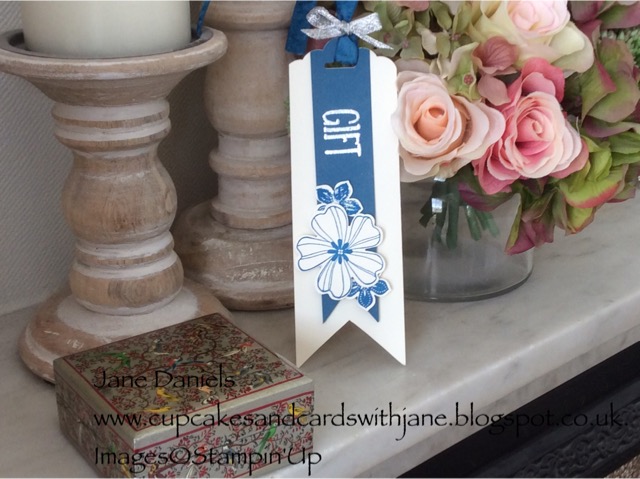
With the scraps left over, I  made a simple matching gift tag using the scalloped tag punch, the same flowers and stamped the word "Gift" from the Perfect Wrapping stamp set and embossed it with silver embossing powder.  The blue strip is only attached at the very top so that it hangs loose and I used the ruched dapper denim ribbon with a tiny bow of silver ribbon through the loop.


I'm getting in my stride now with this blog and hope you are enjoying what I've made.  I don't claim to be an expert cardmaker or stamper but hope that you will see that you don't need to be, to create some nice examples. The co-ordinated inks and papers from Stampin'Up do half the work for you.

Friday 24 June 2016

More of the same

Following hard on the heels of my previous posting, I have made some more cards using the same technique. 

It's very easy to use a set of stamps or dies and produce a nice card and then put them away and go on to the next set, but really you should persevere and try to come up with other variations or improvements because it makes you develop the idea and go forward with it.  

If you ever get a creative block, go back to one of your old cards and try to improve it or bring it up to date. It is surprising how much you have learned or developed since you made the original one.

So, working again with my signature tiny cards and circle theme, this is what I produced.


This card was made using a stamp and punch that has been retired from this year's catalogue but I imagine many of you still use it and if not, there are similar large flowers in  the new catalogue such as the Flower Medallion punch.

Colours chosen are Tip Top Taupe  and Blushing Bride. The tips of the large flower have been slightly curled to emphasise the 3D effect, together with a foam dimensional. The greeting is again from Endless Thanks, printed on a scrap of card which has been lightly sponged around the edge with a sponge dauber. Tiny bright pink accents highlight the flower, but you could equally use pearls of rhinestones.

*********************
Another variation using Petite Petals stamped in Smokey Slate and Tip Top Taupe and punched out, the same large flower stamped in Blushing Bride and mounted on varying sized discs of Tip Top Taupe, White and Blushing Bride. The greetings strip is just tucked behind the flower and glued at that edge, the outer edge is supported by a foam dimensional and is deliberately slightly larger than the largest disc.


********************
Last one today, but this is a style I return to often as it is very easy but effective.


This card is a simpler variation using Pool Party card with a silver foil disc.  The large flower was punched twice, once in Blushing Bride card and then Whisper White card stamped with the coordinating stamp in Blushing Bride. Stick the pink flower flush with the card and elevate the printed flower with a foam dimensional so that the pink flower just peeks out beneath it.  I have stamped a greeting from Endless Birthday Wishes onto a hand cut scrap of white card, sponged round the edge with Pool Party.  The flower is finished with a small matching accent.  

Again, no reason why you couldn't use completely different colours, sentiment or whatever, but try to keep to just two colours that tone together and don't over complicate the design, because this is a very small card.

I hope you like these very simple cards and have a go at making one yourself or use them as a starting point for your own creations.

Thanks for stopping by,

Jane


Product List


<

Thursday 16 June 2016

Spring has sprung!


This is my first blog and I am newly "converted" to using Stampin' Up products. I only wish I had come across them earlier as they are such good quality and design and the coordinated colours make it so much easier to achieve good results.

What makes a good card? Well I prefer simplicity, good colour combinations and balance.  I definitely prefer the "less is more" style.

So my first card using SU products is simplicity itself and requires very little to achieve it. 


Petite Petals is a fabulous kit to start with when combined with its matching punch. Both modern and pretty, it looks good in any colour and it's well worth experimenting  to see how versatile it is. Very good value too, and a set you will go back to again and again.

The design really requires no step by step instructions - it is so simple. Using two toning colours - Blushing Bride and Calypso Coral - I printed 6 or 7 copies of all the various flower designs. It is so simple to punch these out using the corresponding punch; simply turn it upside down, centre the print, and punch! You soon have a satisfyingly large 'heap' of flowers.

I started playing around with these, arranging them into clusters of blossom - perhaps inspired by the cherry blossom that was flowering outside my window when I was working on it.

I had already prepared a base card using Whisper White and Blushing Bride card stock and stamped a greeting using a stamp from the Endless Birthday Wishes stamp set and the stronger colour ink pad . This is a great set as it can be customised to suit the purpose. I'm still not the best stamper in the world but I'm getting better!

Once I was happy with the arrangement of flowers, I glued them down. I always like to let the image overlap the boundary when possible as I think it looks as if the design is bursting forth! 

I highlighted a few flowers by using foam Stampin' Dimensionals to raise them above the drift of flowers and a tiny rhinestone, and added a single bloom  with another rhinestone jewel under the greeting to balance the card. 

Couldn't be easier, doesn't require a mountain of supplies and very suitable for newbies.

*********************

Using the same technique, I went on to make a small  card using Smokey Slate and Tip Top Taupe inks with discs of silver foil card and Whisper White By just changing the colour, this card would be perfect for a wedding present thank you card. 


Thank you for stopping by: if you have any questions please contact me or if you would like to order any Stampin' Up products please visit my online shop which is open 24/7. 

My next blog will have more simple cards using this technique.